My brief says that I have to make a presentation of professional work to WGSN. For any season/market of your choice, refer to the appropriate mood/trend/colour reports on the WGSN website and produce the following final garphics.
1. a line-up consisting of 3 figures from a collection/range.
2. one sample style detail sheet, showing aspects of the garment in line drawn form.
Research
As a specialist trend forecasting site, the natural go-to place for a fashion student creating a collection is to turn to WGSN. With mood/ trend/ and colour reports all dedicated to specified markets, it was the first place I went to gather inspiration.


When on WGSN i looked at the colour trending reports, i had in mind what garments i was going to draw i just needed a colour to be trended throughout my illustrations. I looked on the forecast for summer colour trends and i came across this organic brights theme. I really like the idea of having these bright bold colours, but fading them a little or bleaching them a ittle, to make them less in your face. I looked at the colour trend for the summer because the garments i am illustrating are summer shift dresses and skirts etc.


I love green and orange as colours, but the idea of making them less artificial looking and more 'organic' or natural really appealed to me. I decided to then create some textiles inspired by these two colours in particular. I decided that i would experiment and try out different techniques and processes to come up with potential textile printed garments.
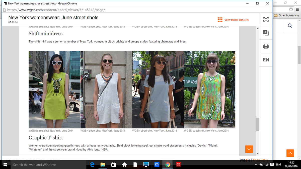
Whilst on the WGSN website i looked at the sort of similar fashion forecast images of my garments i will be illustrating. I was looking for summer dresses, skirts, tops. I came across a few different examples. Alot of these are from like street style, so normal people being spotted in ciies, wearing on trend fashion garments. I noticed that not only were these shift dress and skirt on trend a couple of summers ago, but they are back again and making an appearance for Summer 2016.
Work of Professionals
My next job was to research into line-ups of professionals to see how they presented their work, aswell as seeing what range of source materials have been use within their work. It was interesting to see other people'w work and take inspiration from their pieces, and critic also stating what i would do differently or the same etc.
My next job was to research into line-ups of professionals to see how they presented their work, aswell as seeing what range of source materials have been use within their work. It was interesting to see other people'w work and take inspiration from their pieces, and critic also stating what i would do differently or the same etc.
Pinterest was a great source of research, and i found alot of useful materials. Have a look at the pins on my pinterest account of professional lines up on my page.

This lineup is the has been digitally enhanced on the computer, from designer Amy Dee. What I liked about this piece was the clear indication that one pencil-shaded figure was scanned in, along with the 3 different looks, of which fabrics have been dropped into. What I like most about the line up is the identical faces and bodies within the line up, as well as the fabric swatches used within the line up being displayed along the top. I feel this piece is more than fit for purpose, allowing us to really picture the end result. I think the idea of adding the scanned in image of the textiles wanting to be used for this line up is very useful and adds a nice touch.

I found this image on pinterest and its from a Fashion Sketchbook - mixed media fashion illustrations; fashion portfolio // Andrea Jiapei Li. I like the way the faces, you can only see the lips and halp of the head, and the figure of the line up are all similar with the same stance. But then the outfits although they all have a very 'structered feel' to them, they are all very different. I like that although digitally done, it looks as the outfits have been hand crafted, as if someone has just placed the material onto the figures. I like the idea of it looking half digital and half hand crafted.

I found this Fashion Moodboard by Anjini Maxwell, whilst browsing through Pinterest. Although this isn't a 3 figure line up. I still think it follows the same procedure, the idea of including the same face, and changing the garment.
I love the way it has been digitally done and i liek how it alls overlaps and all has a theme. It has the same colour theme and general feel to the product. Again i like how it looks the mix of media, from photography to scanned in drawings etc. Some time including a mixed media gived the finnal product more depth in my opinion.
The process i used to create my final 3 figure line up with, flat drawing.

I started off by illustrating 3 figures, which all had the same stance, shoes, legs, hands, face and hair. I changed the garment 3each time however. One is a long sleeved dress, the other a playsuit and the other a short sleeve dress with belt. I drew them with pencil, then a fine line pen. Then I scanned them into the computer, and opened them up in adobe illustrator, i imaged traced them and changed the threshold to 203. I then took them into photoshop and filled them with block colours to start with (pink, orange and green.) See my pinterest page for my uploads of these. I liked the colour block but however i really wanted to add my own patter from a textile i have created myself.
How i selected the garment and added colour to it was that i picked the selection tool, and selcted the area of the garment i wanted and then right clicked fill- and choose my colour.

Going with my theme 'organic brights'- i decided to create 3 individual textiles. Using a method of just splashing paint and water onto a page. I splashed pink paint and water, as well as orange and green. I then scanned them in. And instead of the garments being block colour, i was going to then add the pattern in. So as before, i opened up my scanned in textile, using the rectangle tool, i selected what area of the textile i wanted- then i went to edit, define pattern. Then with the selection tool, i selected the area of the garment i wanted to fill with the pattern, and then right clicked fill.

Here shows, the 3 figures with the filled in 3 different textile for each. I then gave it this title. I was very glad at how it turned out, as it was my first time ever doing something like this in my life, using this kind of software. I had this layout in InDesign, set up with the margins and the columns- i find it much easier to visualise the final product. It was now time to move on to the flat drawings.

Because the garments i looked at throught my theme and in my illustrations, shout summer- i thought it was only natural that i did a flat drawing of a dress. I got inspiration of this summer dress with the belt from Pinterest. So i illustrated this in pencil to begin with, then fine line pen- then i scanned it in, and opened it up on Adobe Illustrator, i imaged traced and then increased the threshold to 203. I then decided that i would use my scanned in textile in my flat drawings. So i opened these adobe illustrated edit illustrtaion into photoshop. And used the selection tool, to fill sections with my textiles.

So i decided to section each part of the dress, and choose a different part for the textile. I did the same for the back of the dress. Then when i had finsihed adding the textiles to the front and back of the flat drawing, i then brought them into my InDesign lineup and then began to label key features of the summer dress with belt.

So i then decided to label the features of the dress back and front flat drawings. This was created by a line shape coming from the feature and adding text beside it.

Critique: This image above shows my final product, which i have printed out. Overall i am very happy with my final wgsn lineup and flat drawing. I like how that i have transported the scanned in textiles for my 3 line up into my final falt drawing.
I think that overall the final product looks professional , I like how all the figures line up and are the same size and proportion. I really like how the figures ahve all the same stance, feet, hands, face and hair. I like how i have experimeted with different garments- long sleeved dress, playsuit and dress with belt.
I really like the font style and size, for giving my product a name. I have used the same fotn style but just changed the size for the labeliing of the features in my flat drawings. I also think i ahve brought in the wgsn forecast- 'organic brights' and have went along with the theme of summer dresses and playsuits.
I think for this being my first ever time using InDesign, Photoshop and Illustrator, to create this line up, i am pleased with the outcome and i am pleased at how much i have improved in my skills from September to now.
Areas for improvement: if i was to do this again and have more time, i would maybe think about including a border to the line up- to make it stand out more. Also i would edit the figure with the pink dress witht the belt- there has been an issue when using the selection tool. I havent fully selected the right part of the garment, and have made my textile come across the belt and hide apart of the garments feature. Also with the flat drawing, i found it difficult to select properly the sleeves of the back of the dress flat drawing- i wanted to make them the orange textile. But I found it too difficult to select it though.
Comparing my product to those of proffesional work i have looked at, i am quite pleased. Obviously its important to take into consideration, that the people who create these line ups, have high levels of skill and technique, and that is what they do for a living. But overall the work of professionals that i have liked carry the same features i have shown in my product.
1. simple but bold work.
2. added a personal touch to their work- have made it their own.
3. have a clear message and theme throughout.
I believe i have brought these 3 features into my work, and there is obviosuly areas where i could work harder and experiment more with- but i believe i have taken a good stab at it.


